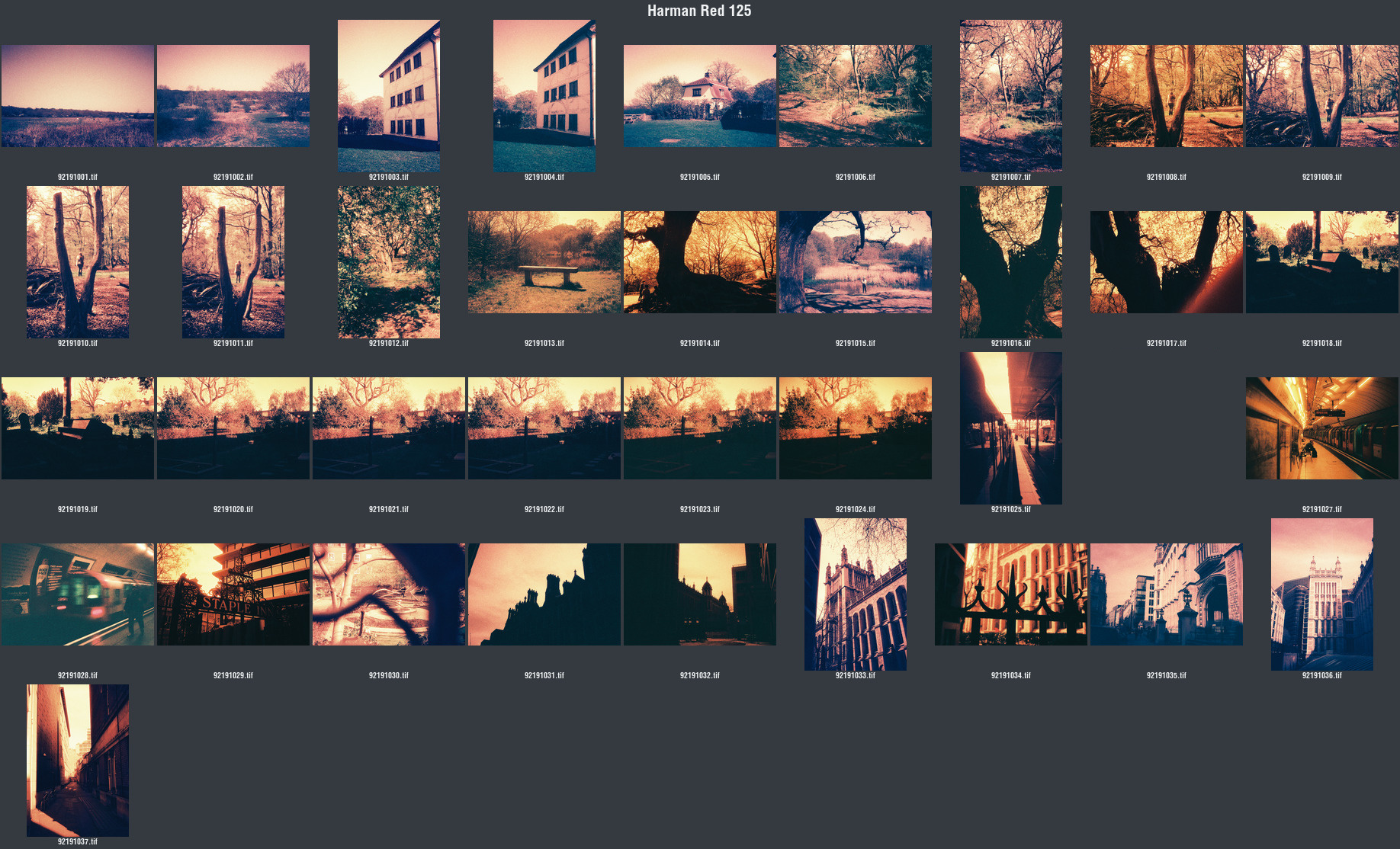
As the title says, I have finally shot a roll of Harman Red 125 (as of a few weeks ago)! This is the first time I’ve ever shot any redscale film, so I wasn’t sure what to expect. This was sent to Harman’s lab for developing and scanning. Here’s a silly contact sheet I generated from the scans because I thought it was interesting (minus a portrait for the subjects privacy):
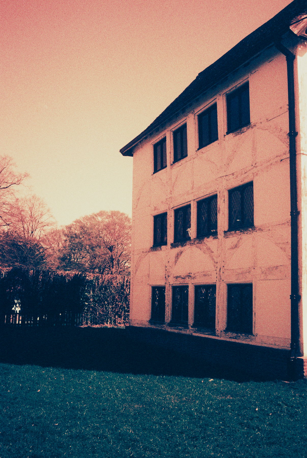
I was very surprised by these to be honest. I shot this roll at box speed (ISO 125) on my Voigtlander Bessa R + Voigtlander Ultron 35mm f/1.7. I wish I remembered how I specifically shot them, whether I leaned towards overexposure, or whether I metered for highlights, etc. So why was I surprised? Well, the examples I was seeing in the limited research I did were very exaggerated. A lot of them were deep, blood red. I’m assuming they were edited in post, and had different lighting. Now that I’m looking at more examples from other people, my results aren’t too weird. Let's go over some specific examples.
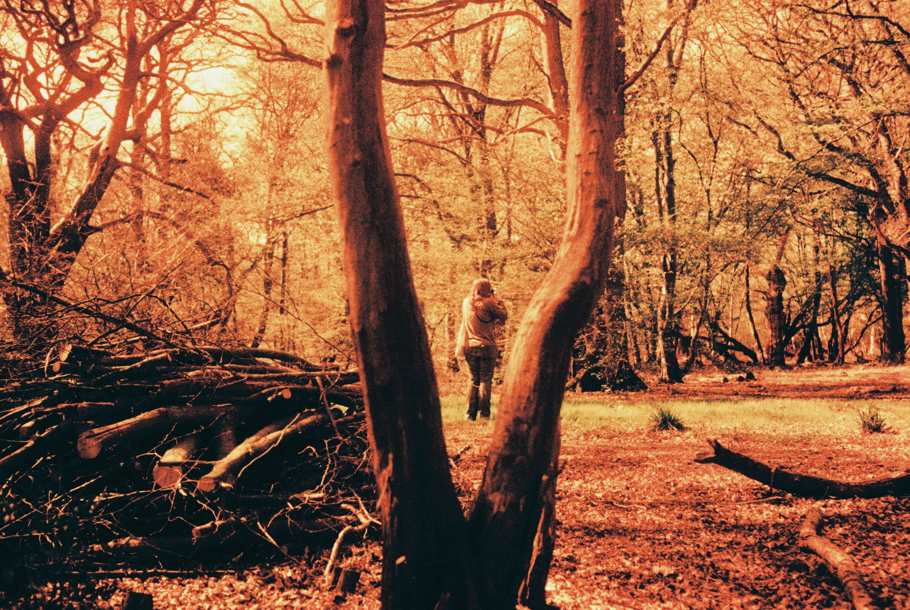
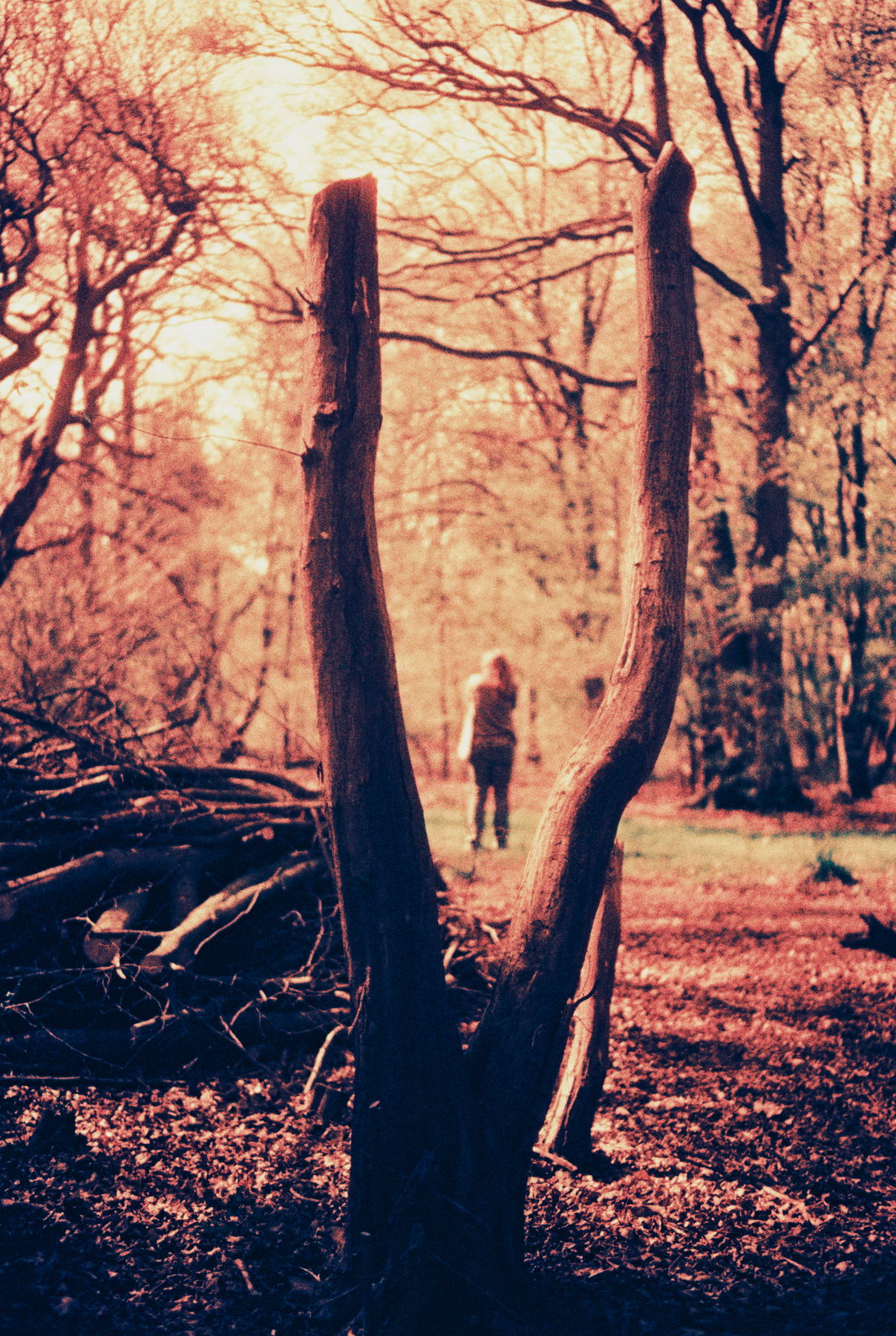
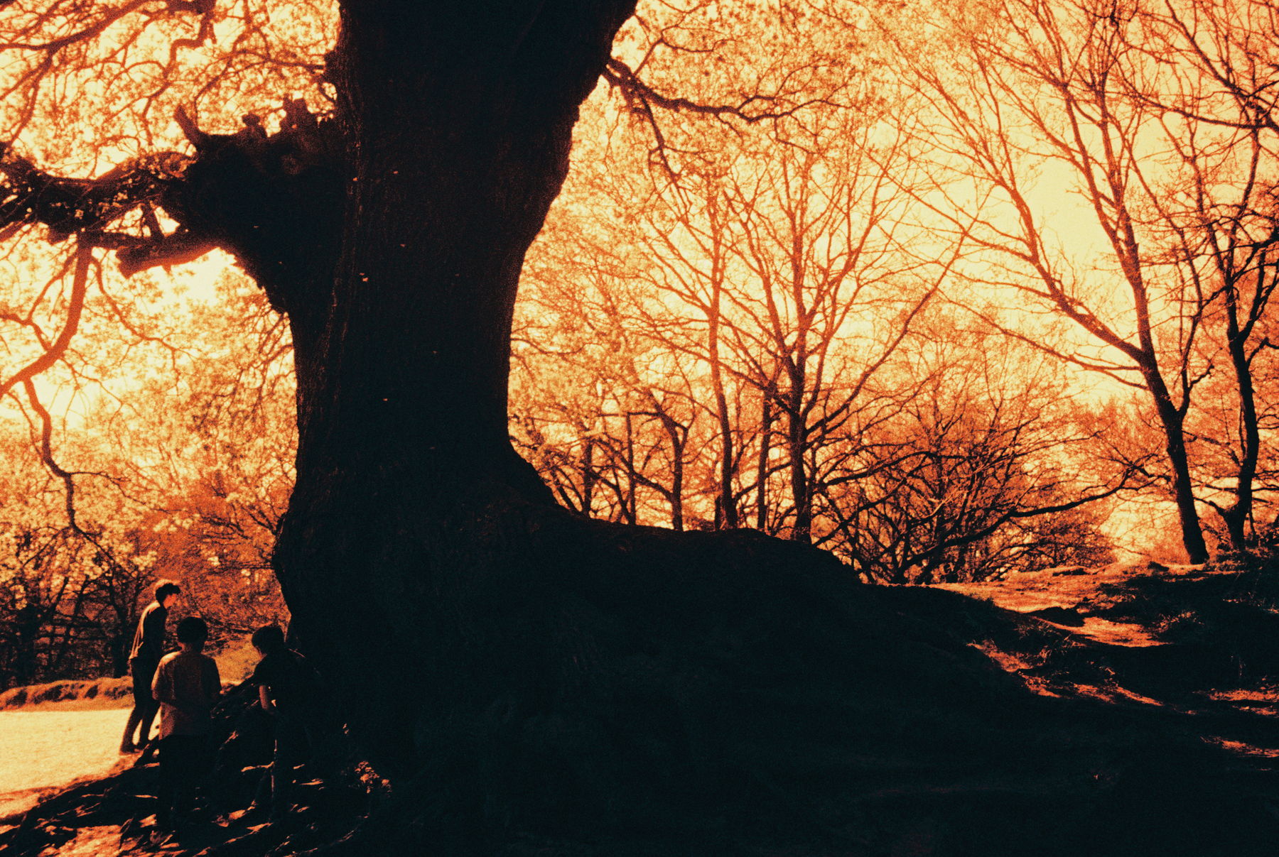
Here’s one of the first shots from the roll. I wasn’t expecting how much the greens came through. Now that I’m looking at the spectral sensitivity of Harman Phoenix 200, I shouldn’t have been too surprised. The datasheet shows that it’s actually most sensitive overall to green light at around 550 nm. Knowing more about how redscale film works, It makes perfect sense that green would come through like this after the reds/oranges.
I like both of these photos a lot, particularly the portrait ones. I've put both of them here to show how the same scene has resulted in two different colour casts. The first having more oranges and yellows suggests to me that It was exposed to more light, whereas the other one got less light so less frequencies got through? I may lean into underexposure more with my next roll.
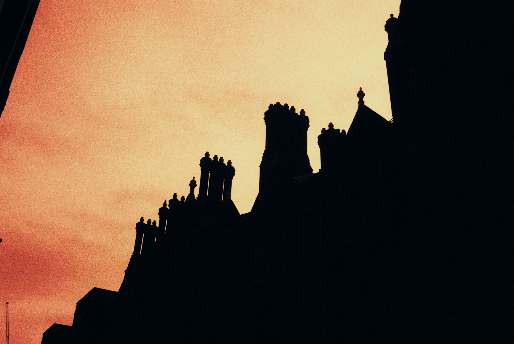
These ones both have some quite harsh silhouetting of the subjects, which I leaned into in the light edits I did.
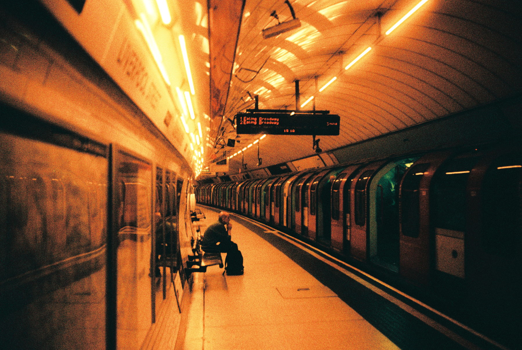
This one is strange to me. It was definitely a longer exposure seen as it's underground. But the fact that some blue light got in is interesting. As mentioned previously, Harman Phoenix 200 is most sensitive to green light, and least to blue (very generally). Red-scaling it (I think) would make the blue layer be the last layer reached by the light, and would be behind the yellow filter. So in theory hardly any blue light should get through. Either way, I like whatever happened.
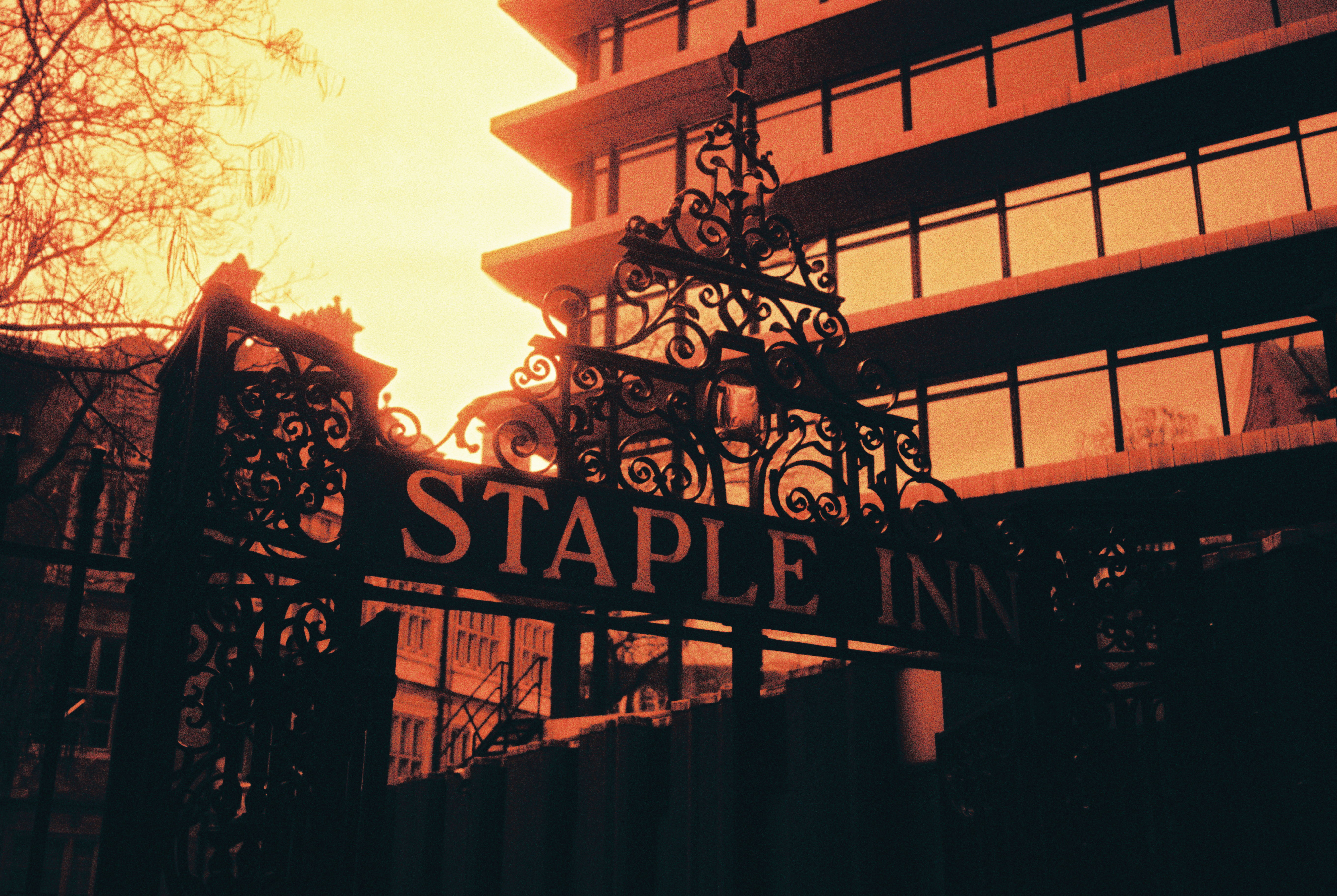
This one feels very gothic to me. It makes me think of something like Bloodborne. I don't have much to say about this other than that, it's one of my favourites.
Overall, I was pleasantly surprised by this film. While my expectation of redscale film being all blood red was wrong, I got a lot more usable results than I thought I would. I want to share most of this roll, but I'll stop here for now. Maybe I'll upload a carousel of all the photos in the style of my old film rolls section, but that's all for now. I'll definitely be shooting this more in the future.
-- Lolei <3
P.S. I'm hoping the next post will be about trichromes. But that depends on the editing. I already struggle with it and this is particularly finicky.